
|
Home
| pfodApps/pfodDevices
| WebStringTemplates
| Java/J2EE
| Unix
| Torches
| Superannuation
| CRPS Treatment
|
| About
Us
|
|
|
pfodWeb
|
by Matthew Ford 422nd October 2025 (originally posted 27th August
2025)
© Forward Computing and Control Pty. Ltd. NSW
Australia
All rights reserved.
This is the fifth tutorial on using pfodWebDesigner to create
interactive and responsive GUI for pfodApp
and the free, open source, pfodWeb.
This
tutorial will cover building a reusable popup help component you can
add to your GUI designs.
Your microprocessor serves all the
necessary code to run the web page controls. No third party
javascript libraries or internet access is needed.
Your
microprocessor pre-loads the help message on the display and a ?
button displays it while the mouse is held down.
pfodWeb
is a free web based partial
replacement for the paid Android app, pfodApp.
pfodWeb runs in a browser and connects to your Arduino board via
either Serial or BLE or HTTP. Using Serial you can connect to any
Arduino board and display the interactive controls it serves. pfodWeb
runs competely off-line. No internet connection is needed. Just
install the pfodParser library and open the index.html in the pfodWeb
sub-directory of the pfodParser library. The interactive controls are
completely defined by the code (generated by pfodWebDesigner) in your
Arduino. Very compact pfod
messages are used to send the controls and receive the user's
commands.
If your Arduino board supports HTTP and has a file
system of 200Kb, then you can load the all pfodWeb files onto your
microprocessor and serve them directly from there.
pfodWebDesigner is a free web based replacement for the free Android app, pfodGUIdesigner. pfodWebDesigner allows you to design interactive and responsive user interfaces for your microprocessor. pfodWebDesigner generates Arduino code that works with all pfodDevices that connect via Serial, Bluetooth, BLE, SMS and WiFi, not just those that have WiFi support. See how to install pfodWebDesigner and Using pfodWeb Designer to Create GUI's. Individual pfodWebDesigner controls are stored as JSON files which you can duplicate, modify and reuse in other designs. Each reused control can be individually scaled and positioned in the final design.
Introductory
pfodWebDesigner Tutorial – Covers setting up
the pfodWeb Designer local server and install the pfodWeb support on
an ESP32. A simple press button example illustrates touchZone and
touchAction.
Reuse
Controls with insertDwg – Covers copying dwgs
and using insertDwg to insert multiple copies into the main
drawing.
touchActions
for Instant Feedback – Covers
using touchActions to give instant feedback in a slider
control.
TouchActionInput
for text/number entry – Covers
using touchActionInput to input text / numbers to your micro
Building
Reusable Controls – This one. Covers building a
reusable popup help button component.
pfodWeb is a free web based version of the paid Android app,
pfodApp. pfodWeb implements a significant subset of pfodApp's
capabilities that is interactive dwgs.
Your micro serves all the
necessary code to run the web page controls. No third party or
internet access is needed.
If you want to support this work, purchase the Android pfodApp
which will work with the same code developed here and which provides
more features such as charting and data logging.
See the free
pfodDesigner
Android app for creating menus and charts for pfodApp.
See the Introductory Tutorial for the parts list and the Installation instructions. Physical parts consist of just an Arduino board, e.g. Dfrobot ESP32 board or other Arduino board. (An UNO does not have enough memory to run these examples)
This control uses the tools and drawing objects covered in the previous tutorials, Rectangles, indexed items, touchActions, hide / unhide and insertDwg to add the control to the main drawing
The design of the popup help is as follows:-
Two filled, indexed rectangles providing a background box and border for the help text.
A multi-line label of the help text.
All of these drawing items are normally hidden.
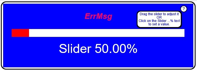
The help ? button is a filled circle with a ? in it and a touchZone covering it.
The touchZone has a number of touchActions which unhide the help text, and its background, while the mouse is held down on the help button.
When the mouse is release, the original drawing , with the help box hidden, is restored.
The touchZone sends a message to the pfodDevice (your microprocessor) when it is triggered, but the code (after editing) just ignores that and sends an empty response, {}
This control will be the last one added to the main drawing using insertDwg. Inserting the drawing last ensures it is assigned the highest index numbers so that the help box and text and help button will overlay all other components of the GUI
Here is the completed popupHelp.json you can load into pfodWebDesigner or step through the build steps below.
Open pfodWebDesigner and start a new drawing, called popupHelp, 50 x 25 with a neutral (grey, 7) background and no refresh. You can adjust the drawing size once you have laded out the help box and button. The background colour will be discarded when this control in inserted in the main drawing.
The help text will be for the previous slider example.
Drag
the slider to adjust it
OR
Click on the Slider ...% text
to
set a value.
NOTE: All these drawing items (except pushZero/popZero) have Use Index ticked. The index names, idx_1, etc are variable names. The actual index numbers are assigned in order the drawing elements are listed.
The help text box consists of two fill rectangles and the multi-line text. The larger, outer rectangle forms the border. While the smaller, inner rectangle sets the background colour for the text box.
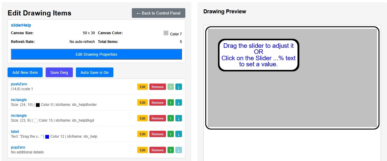
Add a pushZero, X transation 14, Y transation 6, Scale 1, that you can edit to move all the following drawing items to a suitable position.
Add a label to the drawing containing this multi-line line text. Choose a suitable color (Blue, 12) and font size, -4 and alignment Center. Set Use Index.
Add a rounded rectangle (unfilled for now) to enclose the text (24 x 10, Black). When filled this will be the border. Set Use Index.
Add another rounded rectangle (unfilled for now) inside the last one (23 x 9, White). When filled this will be the text background color. Set Use Index
Move the first, outer rectangle above the label in the drawing items list and edit it to be filled with the border color, Black
Move the second, inner rectangles above the label in the drawing items list and edit it to be filled with the text background color, White.
Add a popZero at the bottom of the list to close out the pushZero.
The help button consists of a two circles, border and text background, in which a ? is placed. A touchZone is placed around the button, which when triggered will unhide the help text box while the mouse is held down.
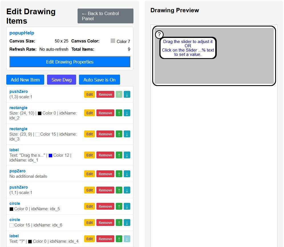
Add a pushZero to start the help button layout. This can be used later to position the help button on any corner of the help text box.
Add a ? in a label (color Black, 0) and position it. ( (1,2) font size -2, centered) Use Index.
Add a circle around the ?, for the border (radius 1.8, Black). Use Index.
Adjust the pushZero to (1,1) to position the button next to the text box.
Add a second slightly small circle around the ?, for the background (radius 1.5, White). Use Index
Move the circles above the ? Label and fill them in with the border (Black) and background (White) colors.
Add a touchZone to cover the ? button (3.5 x 3.5) and centered on it, with the filter, DOWN_DRAG_UP, which will keep the help showing until the mouse is released.
Add a popZero to close out the help button's pushZero and keep help button and its touchZone in the same push/pop zero group.
Add hide items for each of the text box items, the two rectangles and the label, (idx_1, idx_2 and idx_3). This will make them disappear from the preview and this will be how they will be normally when not triggered by the ? help button.
Edit the ? button touchZone to add three touchActions to unhide the text boxes and label, when the button is pressed. The Replace on Touch drop down has an Unhide option at the bottom.
Clicking the help button in the preview now shows the help
text box while the mouse is held down.
If the help text just
flashes, go back and edit the touchZone to have filter DOWN_DRAG_UP,
instead of the default TOUCH
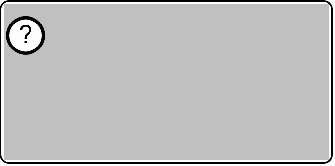
Trim the size of the drawing to better enclose the control, say 30
x 15. That completes the basic popupHelp control. The
popupHelp.json contains
the completed control.
If you find that the ? is missing, go
back and edit the sliderHelp to make the ? Label color Black, 0.
instead of BLACK_WHITE
Here the popupHelp control will be added to the SliderInputErr drawing from the previous tutorial. The completed drawing is SliderWithHelp.zip
To add the popupHelp control in your own GUI :-
Load the SliderInputErr.json and popupHelp.json drawings into pfodWebDesigner
Create a new drawing SliderWithHelp, 110 x 50, BLUE background.
Edit SliderWithHelp and insert the SliderInputErr drawing
Add a pushZero( 2,2,4) to position and scale the popupHelp drawing
Insert the popupHelp drawing and close with a popZero.
Generate the SliderWithHelp.zip file and add the SliderControl files and replace the SliderInputErr files with the completed code from the previous tutorial.
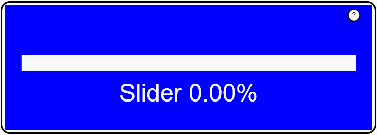
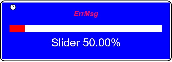
That provides a popup help button at the top left of the slider as
shown above.
Note that the popupHelp drawing is inserted
last, this ensures that when the idx numbers are allocated when the
drawings are sent, that all the popupHelp items have higher indices
then any other drawing item so that they always display on top when
visible.
Inserting existing drawing controls into a new drawing, keeps their file names unchanged when the Arduino code is generated so you can just copy over the completed code files from the previously working control. See step 6 above.
The popupHelp control can be customized to suit various situations. As well as editing the help text, you can easily change the position of the help text box relative to the ? button by editing the popupHelp to position the ? at the top right and then adjust the pushZero in the SliderWithHelp drawing to position the whole popupHelp to the right.
The code generated for popupHelp puts all the indexed items in the Dwg_popupHelp::sendIndexedItems() method. Usually indexed items are the ones update. However in this case once the text is sent in this example it does not change, but with those items appearing in the sendIndexedItems() method which is called from Dwg_popupHelp::sendUpdate() each time the ? Button is released, all the text is sent again. By cutting all the code from Dwg_popupHelp::sendIndexedItems() and pasting it just before sendIndexedItems() in the Dwg_popupHelp::sendFullDrawing() method, the help text is only sent once when the full drawing is sent with its version. There after messages from pfodWeb include the version of the drawing it has cached and the pfodDevice (your microprocessor) only sends updates. The code in SliderWithHelp.zip includes this optimization and only replies with {+} when the ? Button is released.
This page covered designing a re-usable control, in this case a popupHelp control, that can be copied and customized and added you any of your own GUIs. The result is instant display of help text while the ? button is pressed.
AndroidTM is a trademark of Google Inc. For use of the Arduino name see http://arduino.cc/en/Main/FAQ
The General Purpose Android/Arduino Control App.
pfodDevice™ and pfodApp™ are trade marks of Forward Computing and Control Pty. Ltd.

Contact Forward Computing and Control by
©Copyright 1996-2024 Forward Computing and Control Pty. Ltd.
ACN 003 669 994