
|
Home
| pfodApps/pfodDevices
| WebStringTemplates
| Java/J2EE
| Unix
| Torches
| Superannuation
| CRPS Treatment
|
| About
Us
|

|
Protecting Your Superannuation - Background
|
by Matthew Ford 15th October 2020 (Updated 28th
January 2012)
© Forward Computing and Control Pty. Ltd. NSW
Australia
All rights reserved.
This page provides some background to how I came to the current method I am using to protect my superannuation against large falls in the share market. It covers the previous two methods Rev0 and Rev1 and compares all three methods. By all comparisons my current switching method, Rev2, is better. For detailed instructions on how I switch my superannuation using Rev2.1 see this page.
Legal Disclaimer: I do not hold a Financial Advisor’s Licence and nothing in this article should be considered as recommending any particular course of action to anyone else.
“Don't use the moving averages if they did not work last time.”
Having moved all my superannuation in to the Cash Fund when the share market started to fall in late 2007, when the the market looked like it might have bottomed out I started to wonder how I would decide when it was safe to go back into shares. What I was trying to find was a method that was simple enough to apply using charts readily available on the internet. Daryl Guppy (of Guppy Traders) had previously recommended using moving averages as an indicator of when to buy and sell the All Ordinaries Index. In particular, he recommended buying when the 10day simple moving average (SMA) was above the 30day SMA.
I started back testing this on a spreadsheet, taking into account that I could only switch my superannuation once a week and that once I had decided on the weekend, the switch would not actually happen until the next Tuesday. I found that by itself it the 10day SMA over 30day SMA did not keep me out of Shares during the downturn. In particular the method lost money on the May 2008 minor rally in the downward trend. (see the chart below)
Chart
showing the beginning of the Global Financial Crisis
around the
end of 2007 and the rally in May 2008 (vertical line)
To prevent this happening and to improve the overall result, I add two other conditions. a) That the long term average should be rising as indicated by the 40day SMA being above the 120day SMA and b) that there was a rise over the preceding week, so that I did not switch to shares just as the market turned down again. Because the moving averages always lag behind, in sideways markets you can find them telling you to switch to shares just as the market peaks and is turning down, so loosing money.
So my first my switching method Rev0, was to switch to shares when 10SMA is above 30SMA (=3x10) and 40SMA is above 120SMA (=3x40) and the market has risen over the last 5 trading days and switch to cash if either the 10SMA was equal to or below the 30SMA or the 40SMA was equal to or below the 120SMA
I used this method from late 2008 through to July 2010.
The following chart show the estimated performance for the three methods, Rev0, Rev1, Rev2 since July 2000. See below for Rev2.1 compared to Rev2.
The
Yellow line is Rev0 and the Green one is shares with an estimate of
dividends.
When I came across historical share date from Yahoo 7 Finance, I started to try out other combinations of moving averages and back testing them on the data using Java programs. Searching over a number of combinations of moving averages, I came up with Rev1 of my switching method which was switch to shares when 6SMA is above 18SMA and 12SMA is above 36SMA and switch to cash if either 6SMA was equal to or below 18SMA or 12SMA was equal to or below 36SMA. One of the drivers behind choosing these shorter time periods was to ensure I switched out of shares as soon as possible once they started going down.
The performance of Rev1 switching method is shown as the Red line in the above chart.
But there was a price to be paid for this perceived security, the pain index was higher for this method. Even though on back testing it performed better over the long term there were times when it lost more then 10% of the current value of the superannuation fund and if the market was going sideways there were times where it made losses time after time.
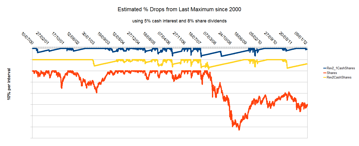
The chart below shows the pain indicator for the three switching methods and for 100% shares. (Rev2 is miss-labelled as Rev3)
The
lines on this chart have been separated for clarity. The pain index
is higher for larger drops and higher the longer the plot is below
the straight line. The drops (10% per interval) indicate losses
relative to the maximum value so far. When the line recovers back to
the straight line, the value of the superannuation has recovered back
to it previous maximum. When the plot is on the straight line, the
superannuation value is increasing above its maximum value so far.
The Green plot showing the 100% shares is clearly very painful as any one who held shares through that period will tell you. Losses exceeded 40% and have still not been recovered. 2003 also saw a painful period with losses of 20 and 8 months to recover from them.
In contrast Rev0 of the switching methods, the Yellow plot, shows less the 10% loss and rapid recovery.
However Rev1, the Red plot, while giving a higher return over the period has a higher pain index then Rev0 due to larger and repeated drops.
Finally the Blue plot showing Rev2 (miss-labelled Rev3), has a lower pain index with fewer and smaller drops, particularly during the recent sideways market conditions.
A 'balanced' fund has about half the pain index of 100% shares but is still much more painful then any of the switching methods.
So in spite of the superior performance of the Rev1, the losses in the current market caused too much pain. So I went looking for again for a better method.
About this time I came across AustralianSuper's Daily differences data and coded programs to model the performance using that data as well as the estimates of performance based on historical indices. The AustralianSuper's Daily differences differ from the All Ordinaries' index due to the application of dividends and the individual performance of the fund managers.
What I was looking for was a simple change to the method that would protect me from excessive losses in sideways markets, where moving averages do not perform well. The previous methods used a second longer time moving average to try and avoid these markets and, as the results of Rev 1 showed, using a smaller second moving average made the method more vulnerable to losses in sideways markets .
After a number of attempts I came up with a simple extra rule, “Don't use the moving averages if they did not work last time.”
Adding this rule and back testing a variety of values, I settled in on these rules, Rev2, switch to shares when 15SMA is above 45SMA and 30SMA is above 90SMA and the last application of these moving averages would have been profitable, and switch to cash if either the 15SMA was equal to or below the 45SMA or the 30SMA was equal to or below the 90SMA
There is nothing magical about the 15 and 30 values. A number of other pairs also produced acceptable results.
The chart below shows the performance of the three switching methods using AustralianSuper's daily differences, (switching between the Cash and Shares fund) as well as AustralianSuper's Balance and Shares funds.
The above chart clearly shows the superiority of Rev2 switching method in capturing the rise in the market while avoiding losses in the sideways market that followed. It should be noted that this chart only goes back to July 2008 and so does not show the full extent of the loss in value due to the Global Financial Crisis. See the top chart on this page for a fuller picture.
The final comparison I use when evaluating a method is the number of switches it makes. The chart below shows the switches between July 2000 and December 2010 for each of these three methods. Each vertical line is a switch.
This chart shows that Rev2 has far less switches then either Rev0 or Rev1.
This is important because switches often cost money or there they are limited. AustralianSuper switches are free and unlimited. Also more switches mean a higher workload in managing your superannuation.
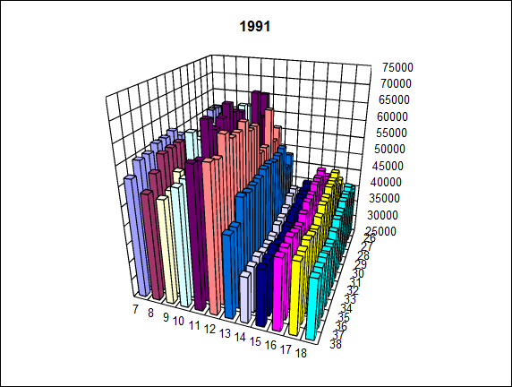
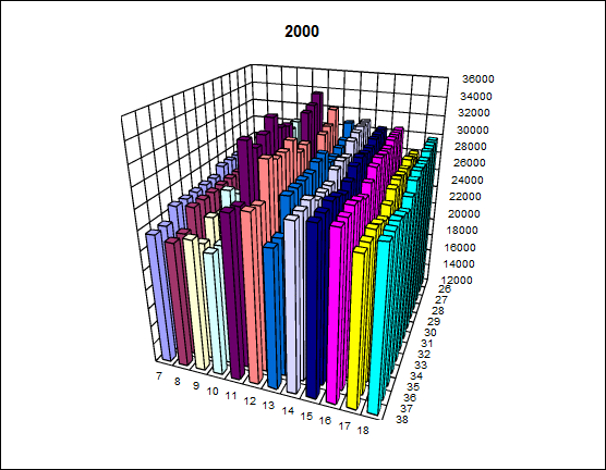
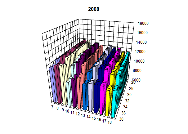
The Rev2 switching method, described above, uses moving averages 15/45 and 30/90. Towards the end of January 2012 I re-evaluated the choice of these moving averages using the latest set of Share data and the AustralianSuper fund data. The 3D plots below show the end value in $ at January 2012, for various values of moving averages, of $10,000 invested in July 1991, July 2000 and July 2008.
For example in the chart below the 15,30 bar shows the result of V2.0. (about $42,800). 15,30 means 15/45 and 30/90, that is 15 and 3x15 , 30 and 3x30.
As
you can see from charts above, there is no one set of numbers that is
the best over all these time periods. I choose 11,33 as the pair to
use for V2.1 of the program. This pair, 11/33 , 33/99 gave almost the
maximum return for those three time periods.
The chart below compares Rev2 and Rev2.1. The upper blue line is
Rev2.1 the green line is Rev2. The red line is shares. The plots at
the bottom shows the switches. The yellow line is the Rev2.1
switches. The bottom black plot is the Rev2 switches. Rev2.1 has more
switches than Rev2.
The next chart shows the “pain index”. The top blue line is Rev2.1, the yellow line is Rev2 and the red line is 100% shares. Bigger drops and longer below the horizontal line mean more pain. Comparing the blue and yellow lines, Rev2.1 (blue) has smaller drops and recovers faster. The smaller moving average 11 for Rev2.1 versus 15 for Rev2 means, Rev2.1 switches into and out of shares faster then Rev2 and so has more switches then Rev2. The extra switches using Rev2.1 is its only downside.
The next plot compares Rev2 and Rev2.1 when switching between the
AustralianSuper Australian Share Fund and Cash Fund since July 2008,
which is the earliest AustralianSuper supplies this data for. Over
this short time interval there is not much difference between Rev2
and R2.1, but Rev2.1 is about 10% better then Rev2 (38% increase
versus 34% increase). Either of them is much better than the
AustralianSuper Balanced Fund (the green plot) or the AustralianSuper
Australian Shares Fund (the red plot).
Finally, from February 2012 I an using AustralianSuper's
Australian Fixed Interest Fund as my '100% Cash' fund. The plot below
(blue) shows the result of Rev2.1 using AustralianSuper's Australian
Fix Interest Fund instead of the AustralianSuper Cash Fund when not
in Shares. This shows a 50% increase over the last three and a half
years. 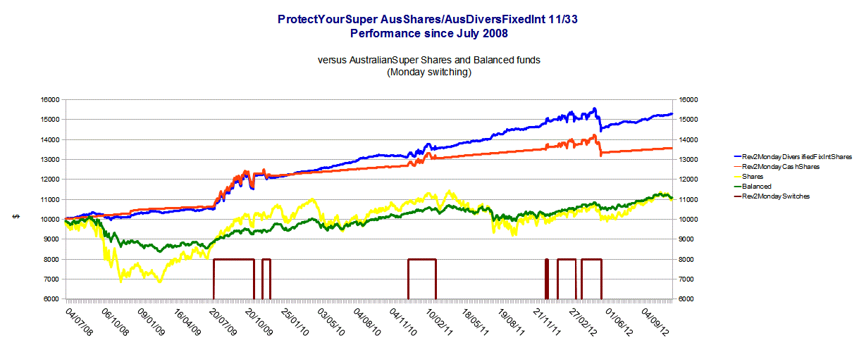 (see
chart below)
From November 2012 I modified the definition of profit in Rule 3. Rule 3 now uses Monday's values for calculating the switch (AustralianSuper uses Monday's prices when you switch between funds) and in order for the switch to be counted as 'profitable' it has to make more money then the 'cash' rate of 5% per annum. (see chart below)
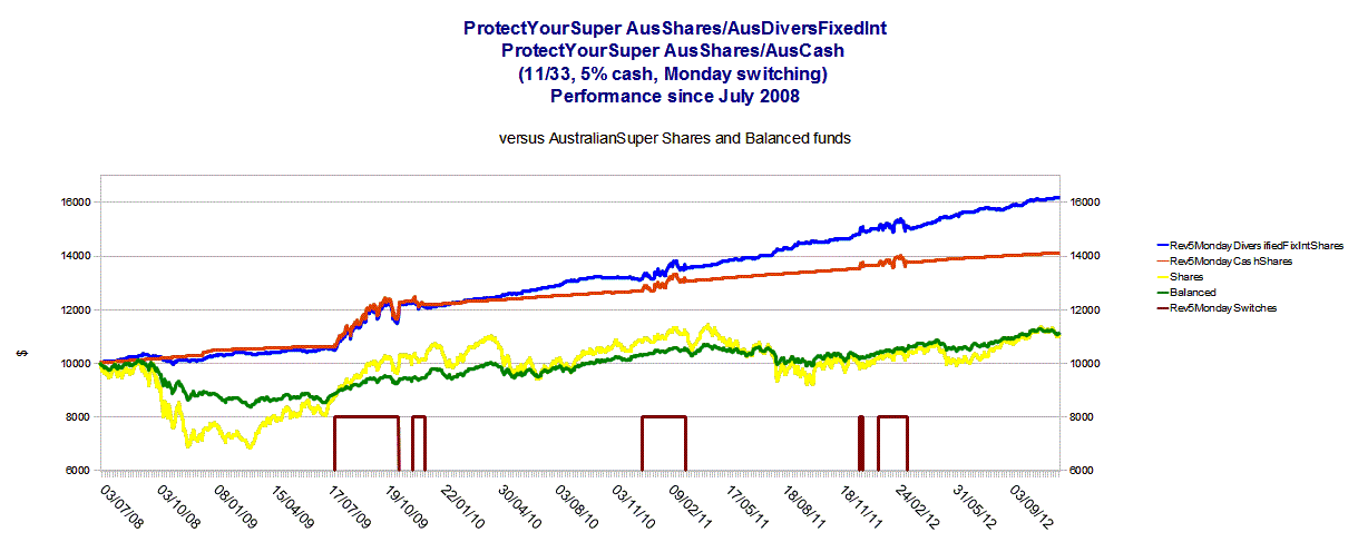
This gave a better result with less switches and is the what I am currently using.
So the above charts show that comparing Rev0, Rev1 and Rev2, my current switching method, Rev2.1.4, has better performance. It also has a lower pain index and involves far less switches then Rev0 and Rev1. Rev2.1 does have more switches than Rev2. This not a problem when using AustralianSuper Funds but may be more costly if using funds that charge for switches or only allow a limited number of free switches per year.
Rev2.1.4 uses for its two moving average crossovers of 11 over 33 (=3x11) and 33 over 99 (=3x33), and requires switches to shares to be more profitable then a 5% cash rate.
I will be reviewing the performance of these numbers (11,33) against others as time goes on, but for the moment (as of November 2012) they are what I am using.
Contact Forward Computing and Control by
©Copyright 1996-2024 Forward Computing and Control Pty. Ltd.
ACN 003 669 994