
|
Home
| pfodApps/pfodDevices
| WebStringTemplates
| Java/J2EE
| Unix
| Torches
| Superannuation
|
| About
Us
|

|
Coronavirus Update Charts
|
by Matthew Ford 20th Oct 2022 (original 7th
April 2020)
© Forward Computing and Control Pty. Ltd. NSW
Australia
All rights reserved.
Starting 20th October 2022 only the NSW deaths since 1st January 2022 will be updated as the figures on actual COVID cases is becoming unreliable due to under reporting, removal of the need to report in most cases.
These chart of Deaths in NSW will be updated on an approximately weekly basis. Dates are in year/month/day format.
The plots of Covid case are retained for historical reference only. See here for How to read these charts.
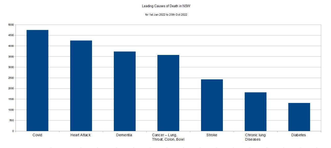
The next chart down is a chart of the leading causes of death in NSW for 2022, so far. (added 30th Jan 2022 will be updated approximately monthly). Covid deaths are rising and are ~11% higher (and rising) than the next highest cause (heart attack), due entirely to the disastrous NSW government actions. (VIC is similar)
References: Covid
deaths in NSW: https://www.covid19data.com.au/deaths
Other causes of Deaths:
https://www.abs.gov.au/statistics/health/causes-death/causes-death-australia/latest-release#australia-s-leading-causes-of-death-2020
prorated for NSW population and the number of days so far this year
You would expect countries with larger populations to have (on
average) more cases.
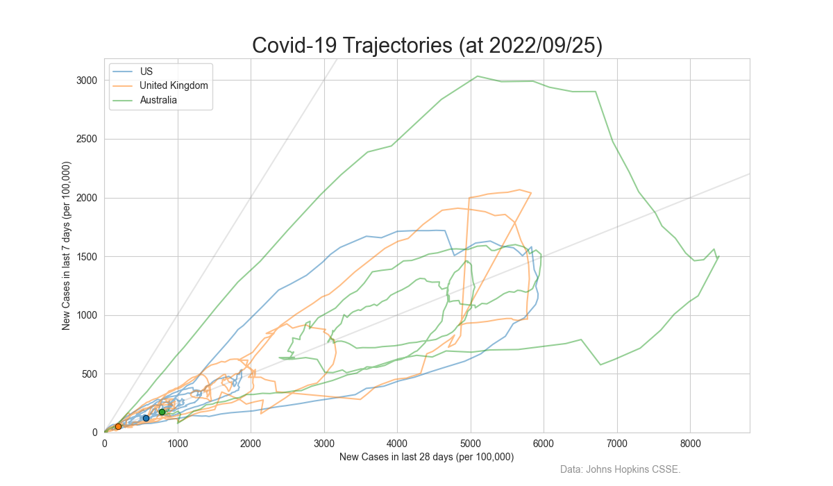
So to get a better feel for relative
response of a few countries, the charts below show the progress based
on number of cases/100,000 population.
As at 19th September 2022, Australia is still well above both the US and UK in cases/100,000.
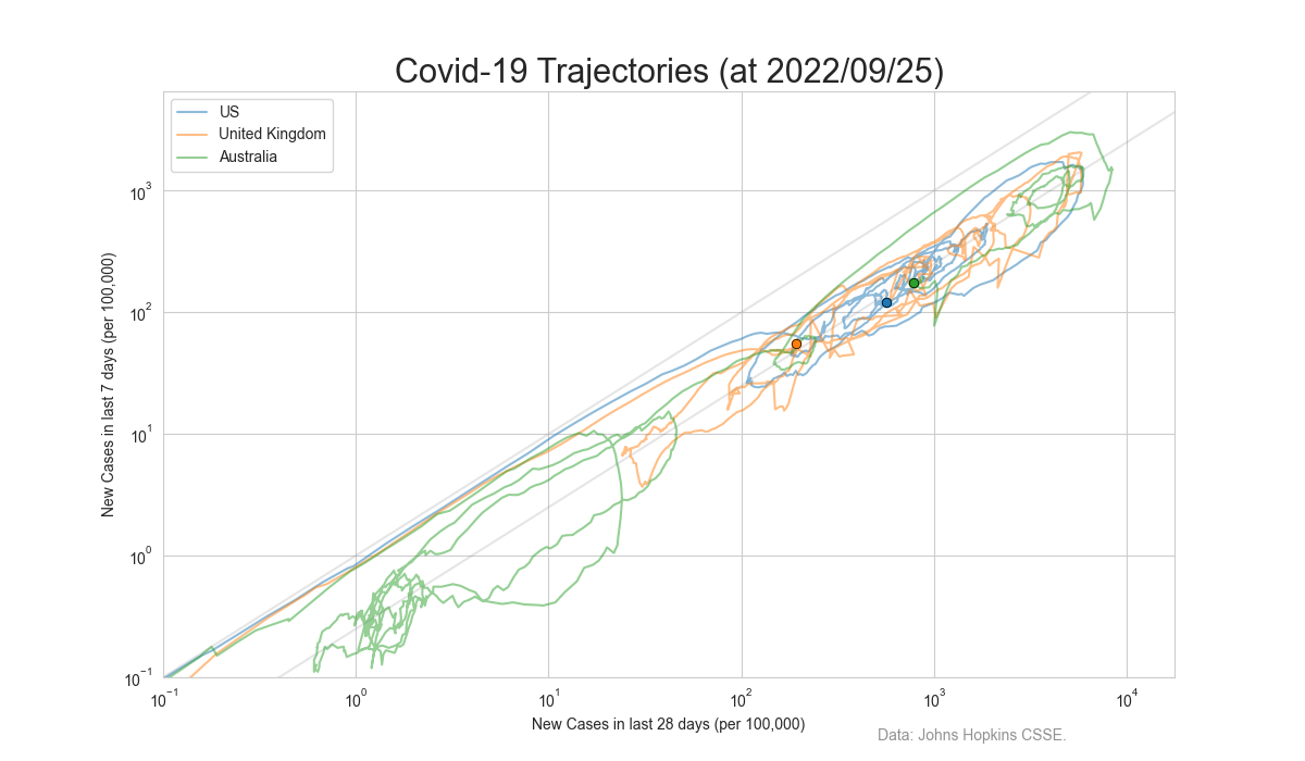
This is the same chart as above but on a log/log scale
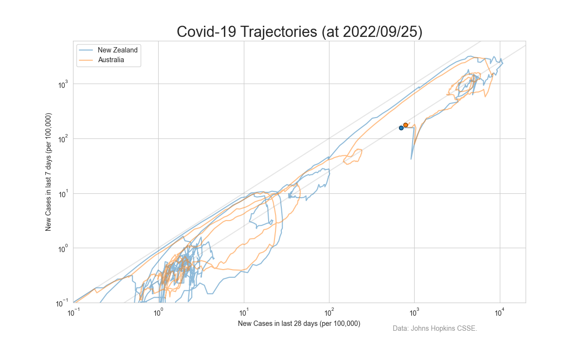
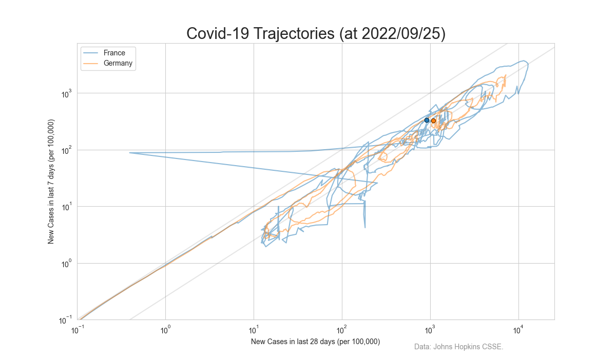
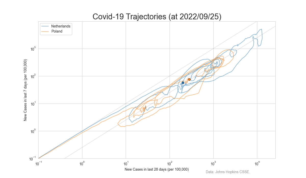
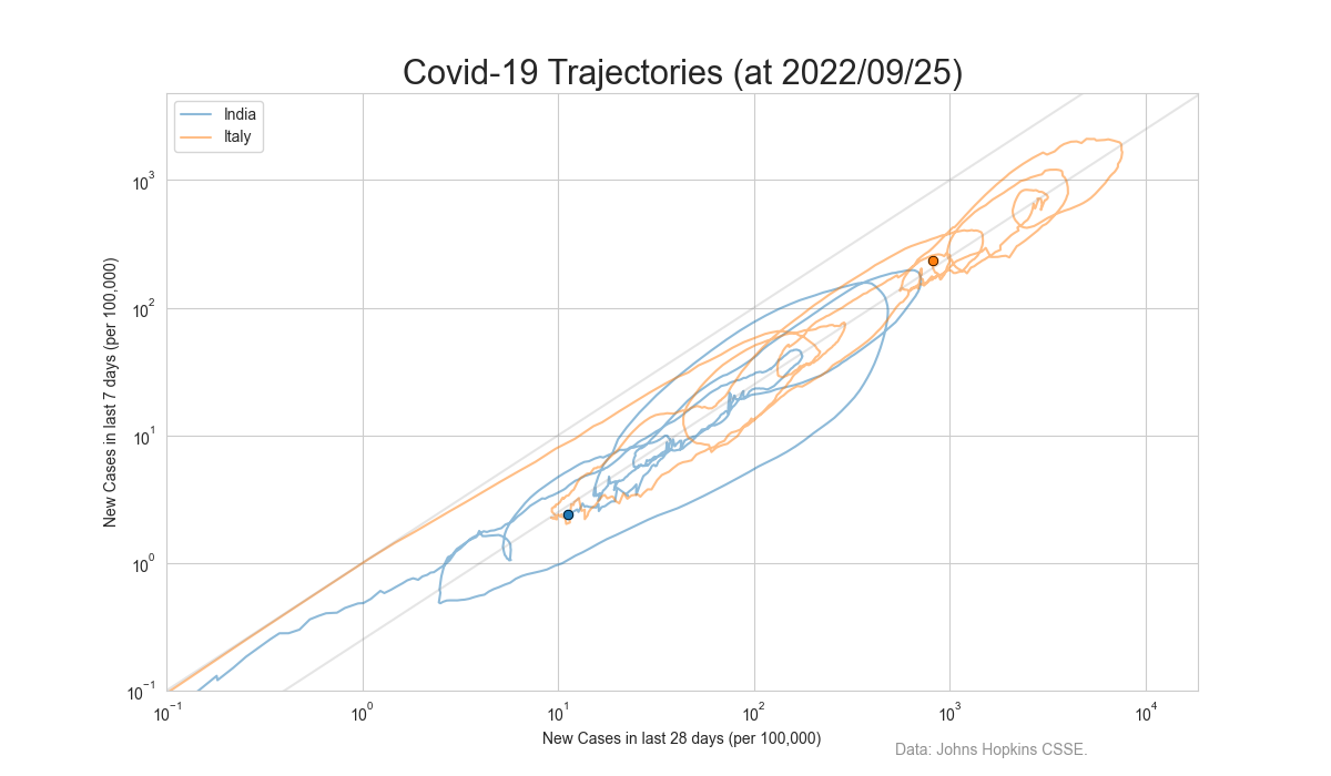
Another set of plots on a log/log scale.
Australia and New Zealand
France and Germany
Netherlands and Poland
Italy
South Korea and Hong Kong
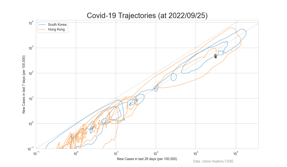
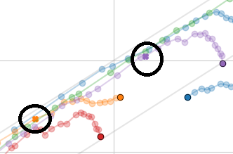
There is a dot per day with the last dot being the chart's date. These charts show the pandemic's progression in more detail than alternative charts which loose detail as the number of cases increases.
The charts plot the number of cases in the previous 7 days against the number of case in the last 35 days on log scales. That is the approximate new cases versus the currently active infective cases. Cases that are more then 35 days old have resolved. That is the people have either recovered, or died, and are not infective any more. (Previously the charts were 5 days / 30 days, but using weekly multiples (7/35) gives smoother charts).
Countries with plots moving up are getting more new cases. Countries with plot moving right have more active infective cases. Plots going down or to the left are countries that are getting better.
There are two diagonal lines on the chart. Countries with plots near the upper lines are experiencing rapidly increasing numbers of cases. Countries with plots on the lower line have stabilized the number of new cases. Countries with plots below the lower line are reducing their cases.
If the country name has a date associated with it. That date is the start of its lock down and is shown on the charts with a small cross.
All these charts are in-accurate to the extent that the countries are not conducting wide spread testing to determine the true extent of the virus in asymptomatic carriers who can infect other people.
Contact Forward Computing and Control by
©Copyright 1996-2020 Forward Computing and Control Pty. Ltd.
ACN 003 669 994